The Challenge
The River of Grace wanted a new logo that not only represented them as a church but was also clean and modern.
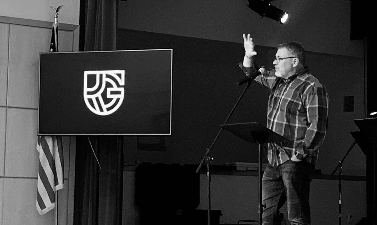
The Solution
The overall form is a combination of the letters ROG (the abbreviation of the church name is also how it refers to itself) in the shape of a shield in reference to the shield of faith in Ephesians 6:16. We decided early on that the color palette should be black and white to add to the minimalness of the design, and not distract from the bold forms of the logo. Once the logomark was created, it was used in a few different lockups and badges, as well as on mugs, sweatshirts, and signs.
![]()
![]()
![]()
![]()
![]()
![]()
![]()
![]()
![]()
![]()
![]()
Welcome to the bottom of the page. If you’re a business that needs a new logo or maybe a brand refresh, or someone with dreams of creating a business that will need a logo, THE MACHINE can help. Let’s talk.