The Challenge
Create a site for Amy Dutton Home that not only showcases Amy’s triple-threat areas of expertise (Architecture, Interiors and Landscaping), but also provides an easy way for users to learn about the Showroom (Amy’s physical location), as well as schedule a meeting with Amy to discuss design projects.
The Solution
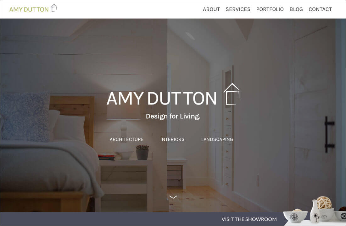
Because Amy is a designer, she has a lot of amazing imagery. Using her vibrant photos as parallax, as well as static backgrounds, we were able to showcase her work while also providing a clear sense of her personality throughout the site.
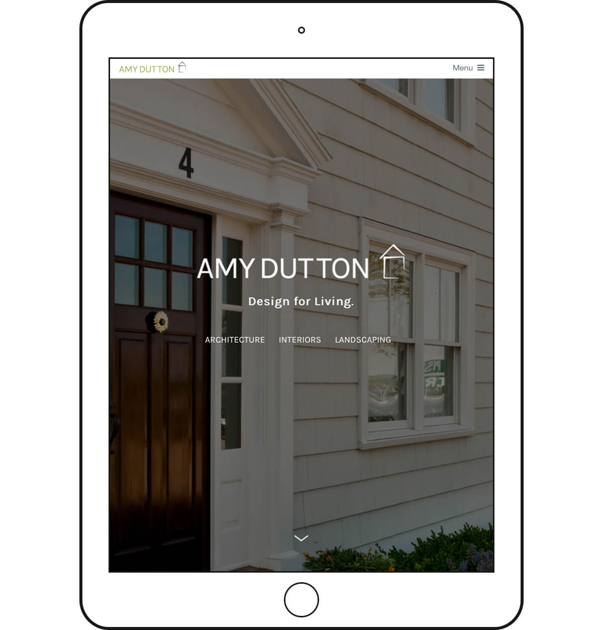
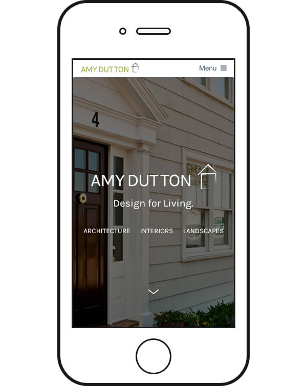
The Home page hero images are great examples of this – initially loaded at full device height, they provide a big, bold, beautiful introduction, no matter what device the site is viewed on.
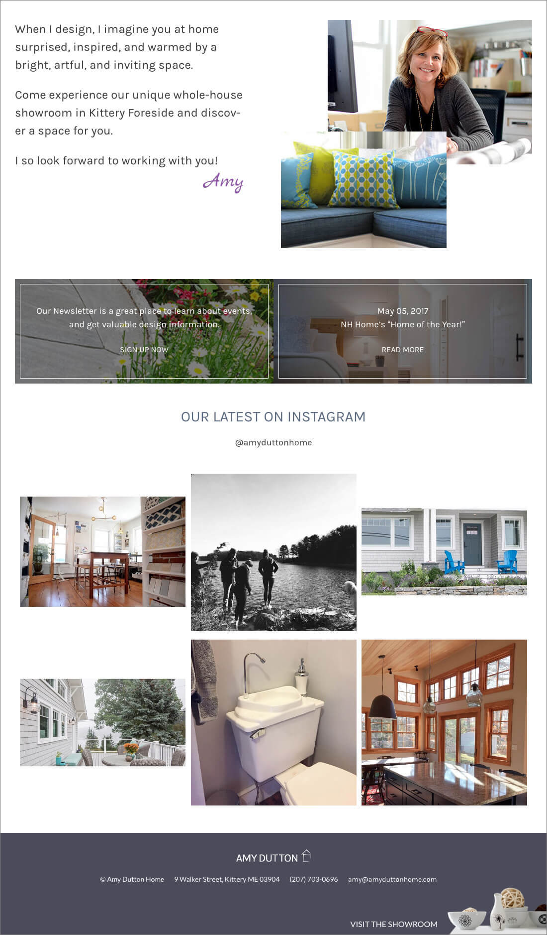
We also created a sticky footer CTA (Call To Action) that leads directly to the Showroom page. This constant, yet gentle visual anchor reminds users of the Showroom no matter where they are on the site.
The rest of the homepage flows easily in a combination of 1, 2, and/or 3 columns of content.
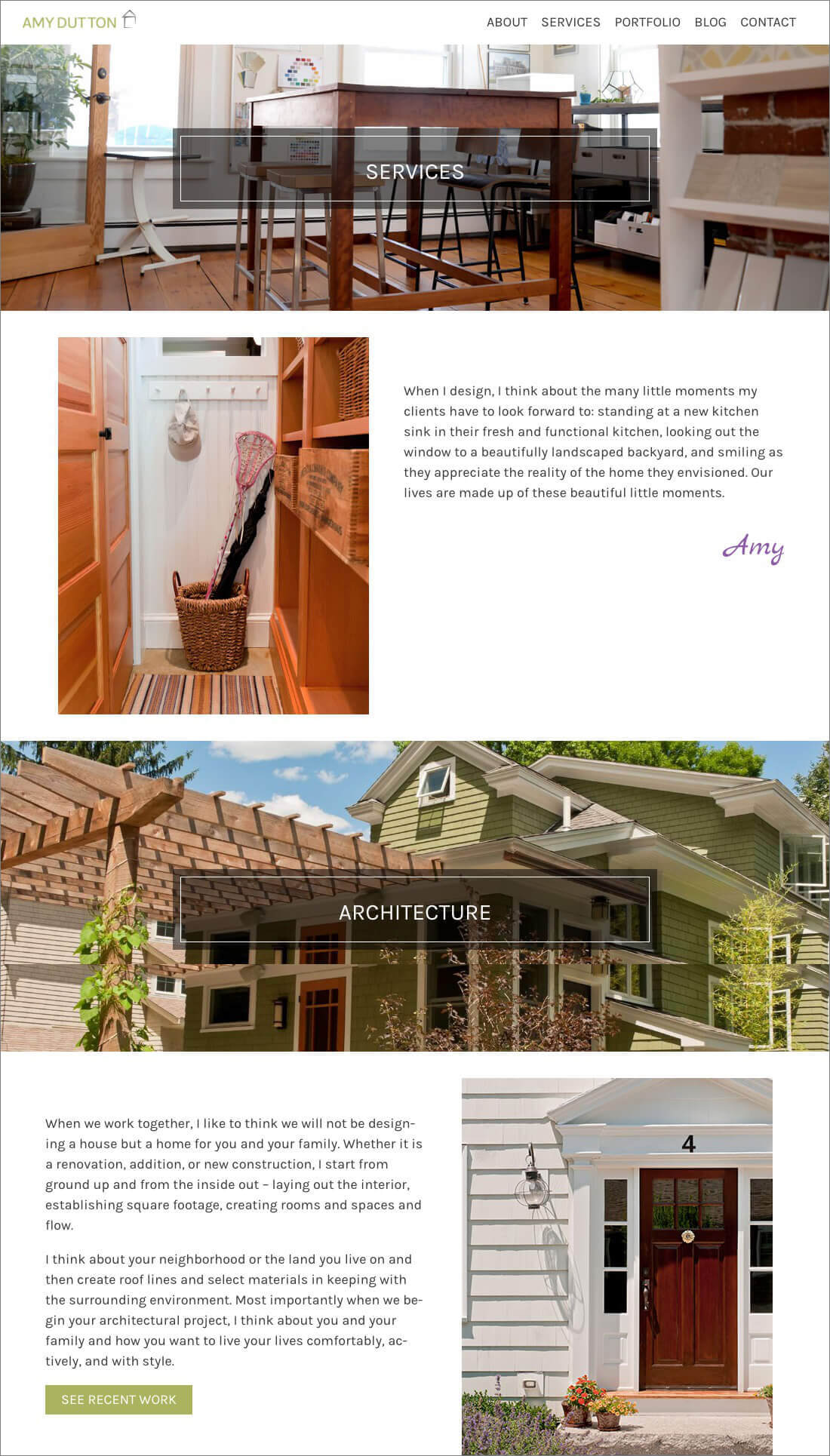
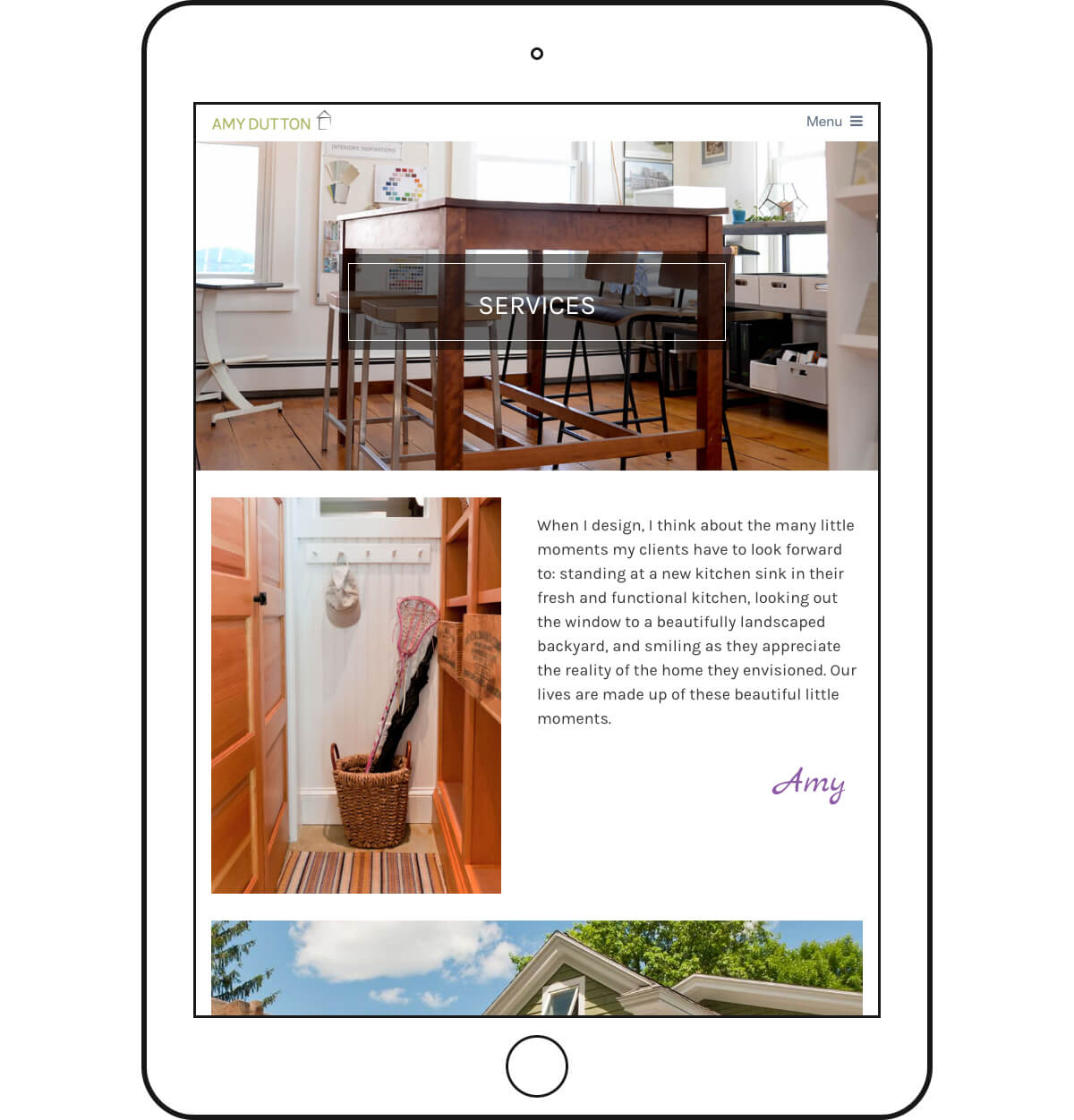
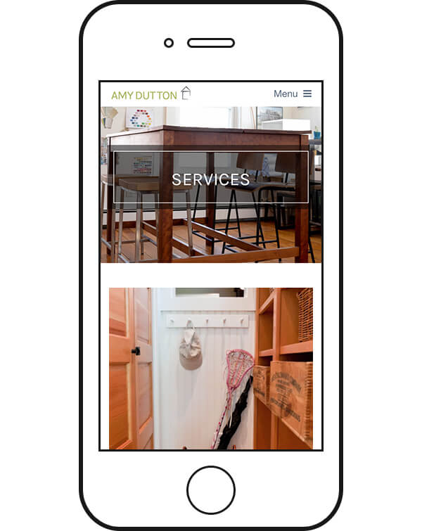
Inner pages have generous header images as additional space to show Amy’s work. Content areas utilize the alternating grid of text and images established on the Home page to produce an information flow that is organized and beautiful.
We also provided places throughout the site for Amy to express design thoughts and words of inspiration.
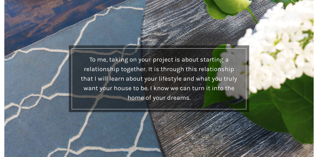
Text boxes with darker background colors allow copy to be readable over bright vibrant photos, without the need to darken or shade the entire image.
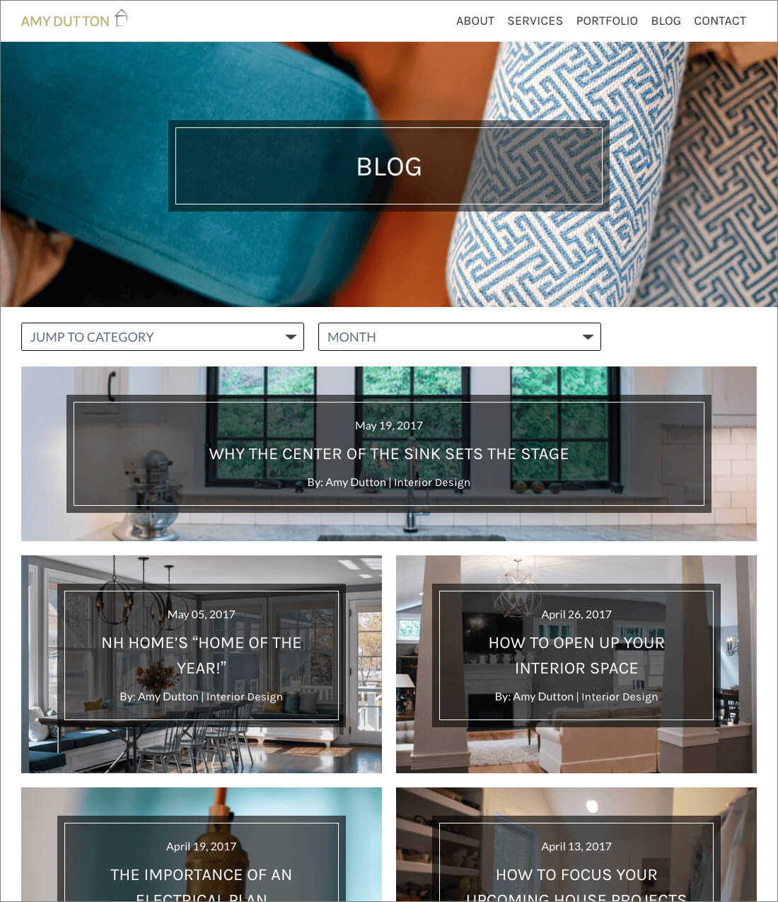
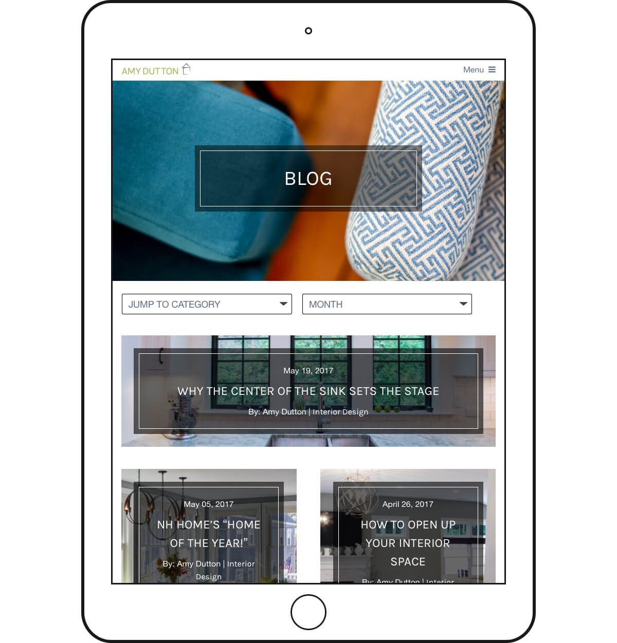
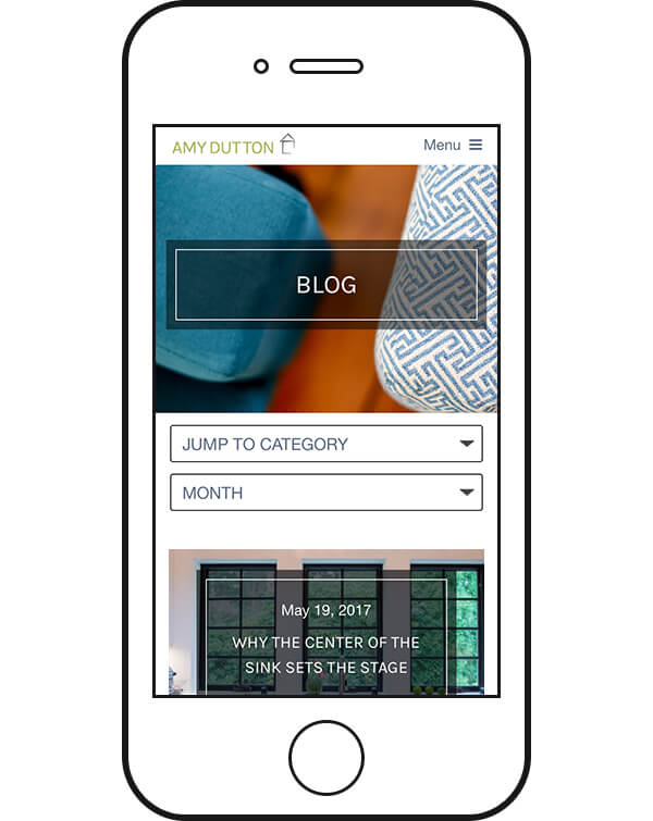
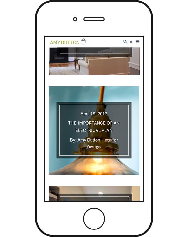
The Blog landing page establishes a content hierarchy using a single column featured post image, then switches to a 2 column grid for older posts. Filters allow a user to organize and choose posts to read based on a specific category of interest or date.
The tablet and mobile resolution experience is similar to desktop (though the sticky footer is removed in order to allocate more space to content) presenting the same information in an orientation and size that works well for smaller screens.
This site was another amazing super-style collaboration with my marketing agency cohorts at Stout Heart.
Welcome to the bottom of the page. If you need a new website design, a graphic refresh, or maybe just some suggestions on how to improve the site you have, THE MACHINE can help. Let’s talk.