The Challenge
Because on Grove founders Landis and Sarah are so creative, they wanted their site to be unique, interesting and beautiful, while still offering an intuitive, enjoyable user experience.
The Solution
These medium fidelity wireframes (more than just simple boxes, but without color or specific fonts etc.) helped in figuring out the user flow and hierarchy of information for the on Grove site. They also helped us transition to the design phase easier – once they were approved, there were no big surprises with the user interface and overall layout.
Bottom Navigation
This is the next big thing man! Seriously though, as our phones get bigger, it becomes more and more difficult to hit the nav/menu icon in the upper left or right corners while using the phone with one hand. This frustrates me. A lot of apps already use a sticky bottom nav (Twitter, Facebook etc) for all the important/most used stuff. Secondary items like search can still be in the header nav (especially on mobile).
Home Page
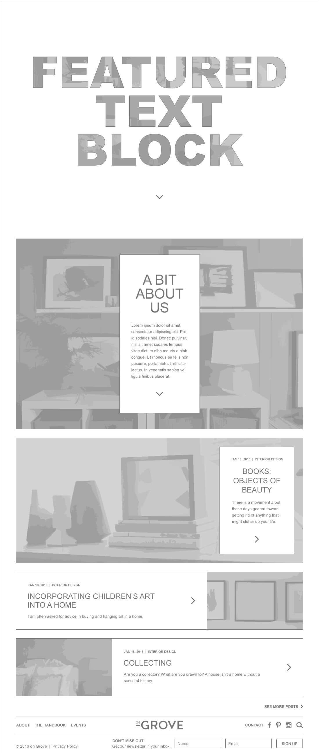
The initial page view is purposely minimal, with large feature-text used as a mask for one of on Grove’s great, bright colored, photos. This is an interesting and unique way to go beyond the “large rotator header pic with text over it” – because, let’s be honest, rotators are quickly becoming a thing of the past.
Scrolling the page reveals the photo beneath as well as the text box with a (very) brief description of what on Grove is and does. Below that are the 3 most recent blog posts. To set up a hierarchy, the most recent (featured post) has the largest image, while the other 2 are a lot smaller.
The footer (which includes the Newsletter Signup) is below the scroll at the bottom of the page. Once a user scrolls to the bottom of the content, if they keep scrolling, the footer will push the sticky bottom nav up. Since someone signing up for the Newsletter is of secondary importance to on Grove, putting the signup form at the bottom of the site is acceptable, and will work well in the design.
About Us Page
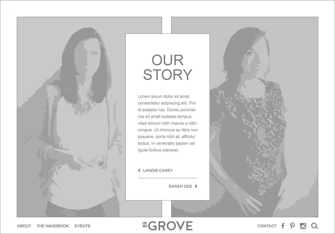
The default “About Us” page view displays a short bio and features photos of Landis and Sarah. Clicking one of the links (“Landis” or “Sarah”), expands the text box to the left or right to cover one of the photos. Information about the specific person is displayed in the expanded box, along with links to their individual business websites. The content box/area is scrollable while the photo remains stationary.
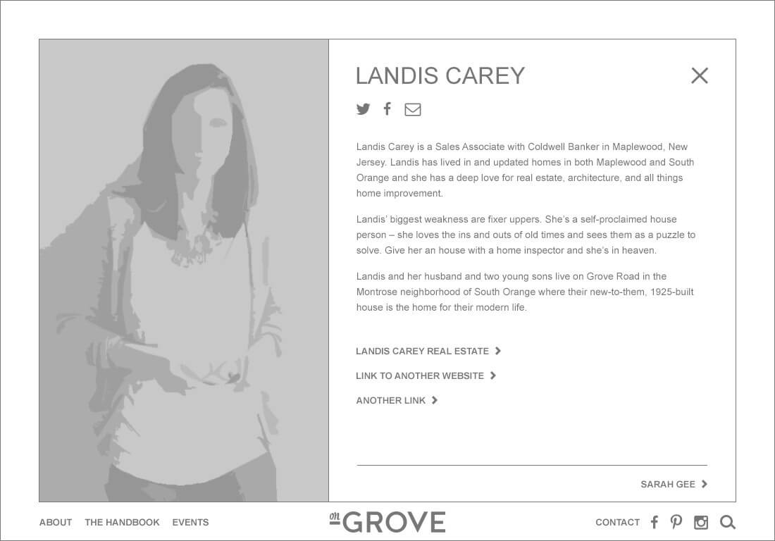
Clicking the link at the bottom of the content area takes a user to the other person’s content page. Ideally, the content will fade out, the content box will animate/transition to the other side of the screen and new content will fade out/fade in. Clicking the close “X” returns the user to the default “About Us” view.
The Handbook (Blog Main Page)
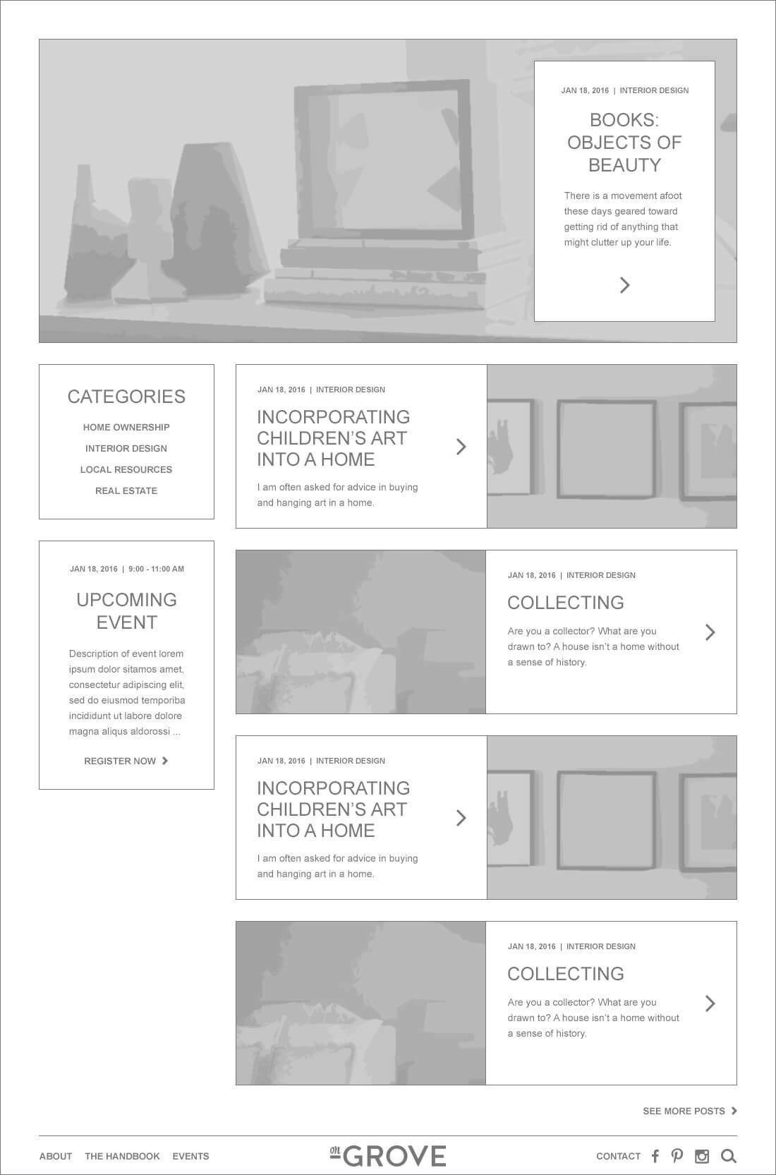
The featured post (also the most recent) is at the top of the page (similar to the homepage) with the rest of the posts below. Categories are in the left column, similar to a left side navigation. Under the Categories box, there’s room for a featured event area. Clicking a post will take the user to the full blog post page.
See the full on Grove design here.
This site was another amazing super-style collaboration with my marketing agency cohorts at Stout Heart.
Welcome to the bottom of the page. If you need a new website design, a graphic refresh, or maybe just some suggestions on how to improve the site you have, THE MACHINE can help. Let’s talk.