Let’s Get Social
In most of the examples below, I worked with a copywriter or another marketing person that provided the messaging content while I focused on the look and layout of the designs (although I did make suggestions on the content when layout space required re-working things a bit).
Colorado Co-Op
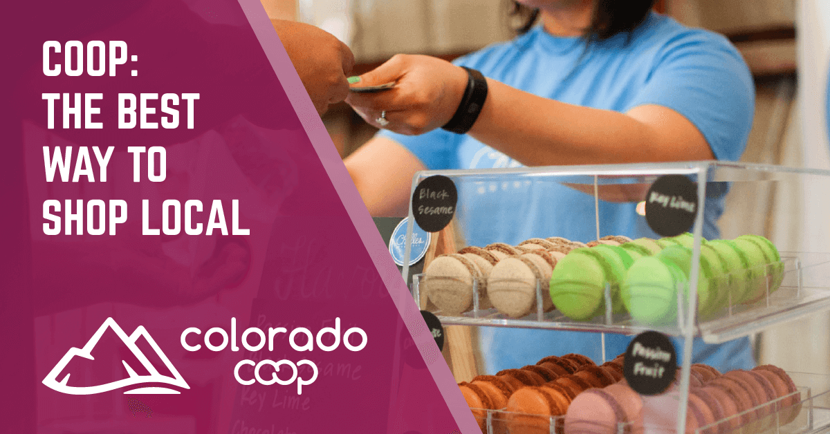
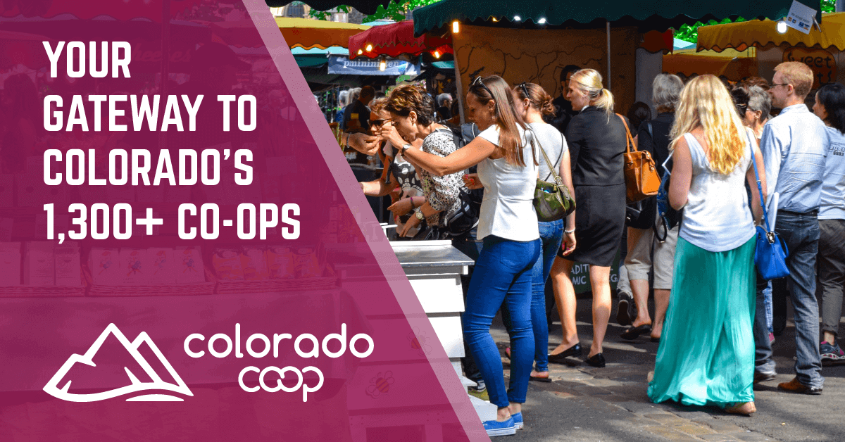
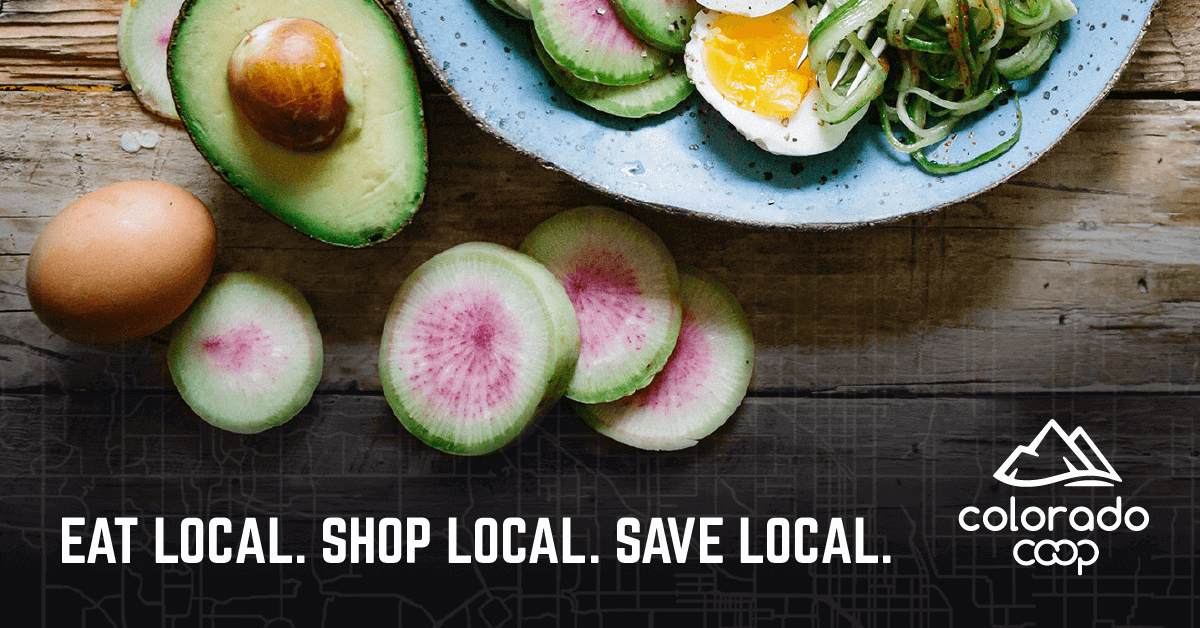
CCA Global Partners forms cooperatives with family-owned businesses to help them compete with larger national corporations. I designed a series of targeted ads to increase brand awareness and audience engagement for CCA’s Colorado Co-Op as it prepared for an annual event. Although each ad design is different, they all share the same branding elements such as logo and colors based on existing brand guidelines that I was able to expand upon and improve. Not only did the campaign successfully build greater brand awareness and online engagement for the co-op itself, but it also increased event attendance from the previous year by almost 300%!
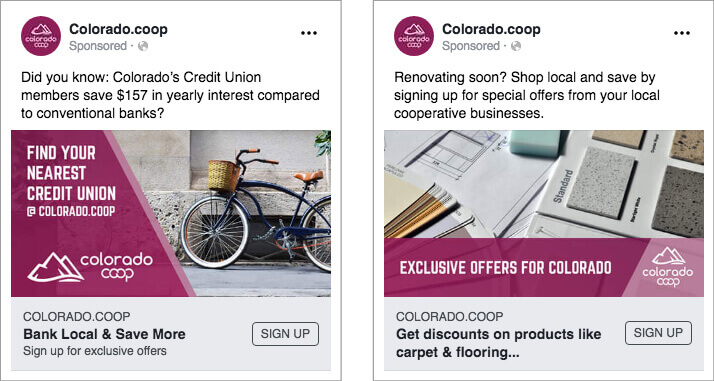
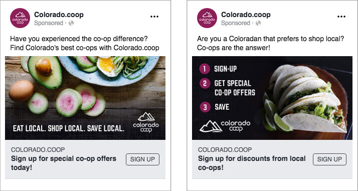
Carousel ads were used to share messages in interesting and engaging ways. The first example uses the visual metaphor of tree roots to create an interesting infographic.

The carousel images below use the peaks of the CCA logomark as an interesting location for the branded messaging points.

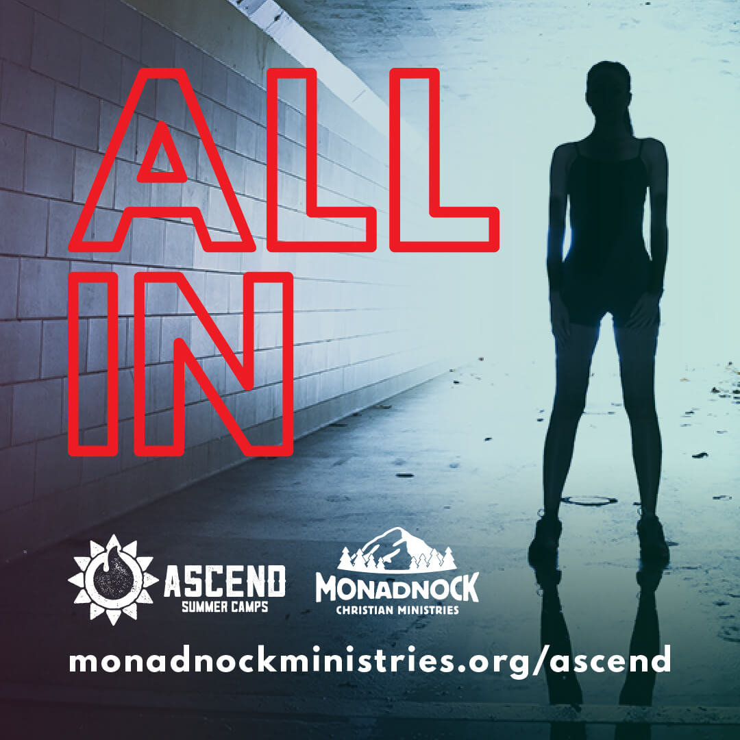
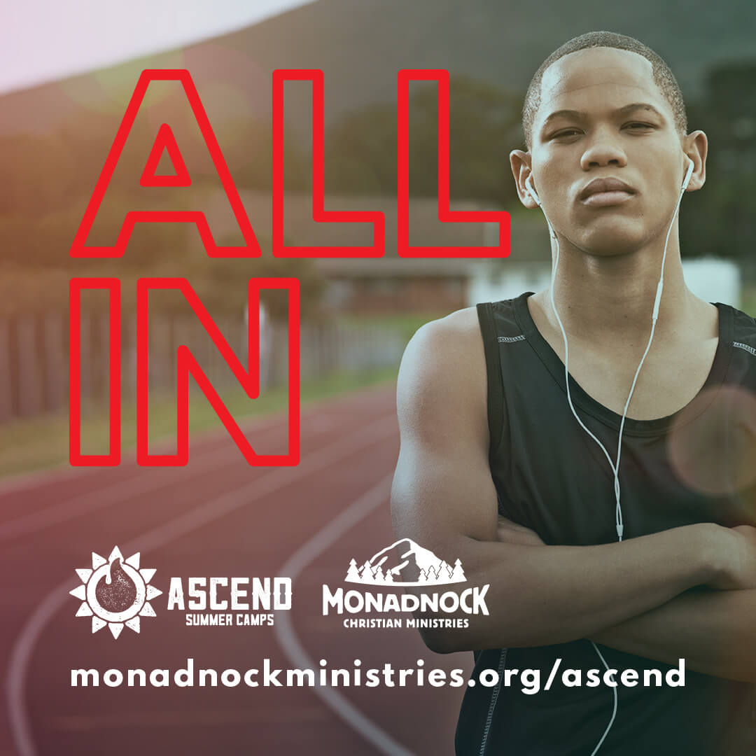
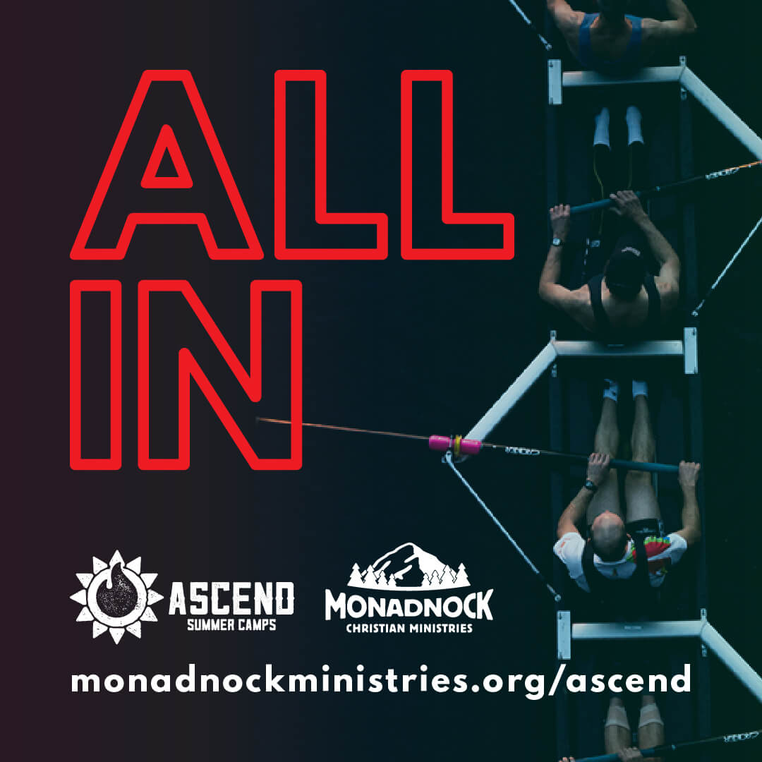
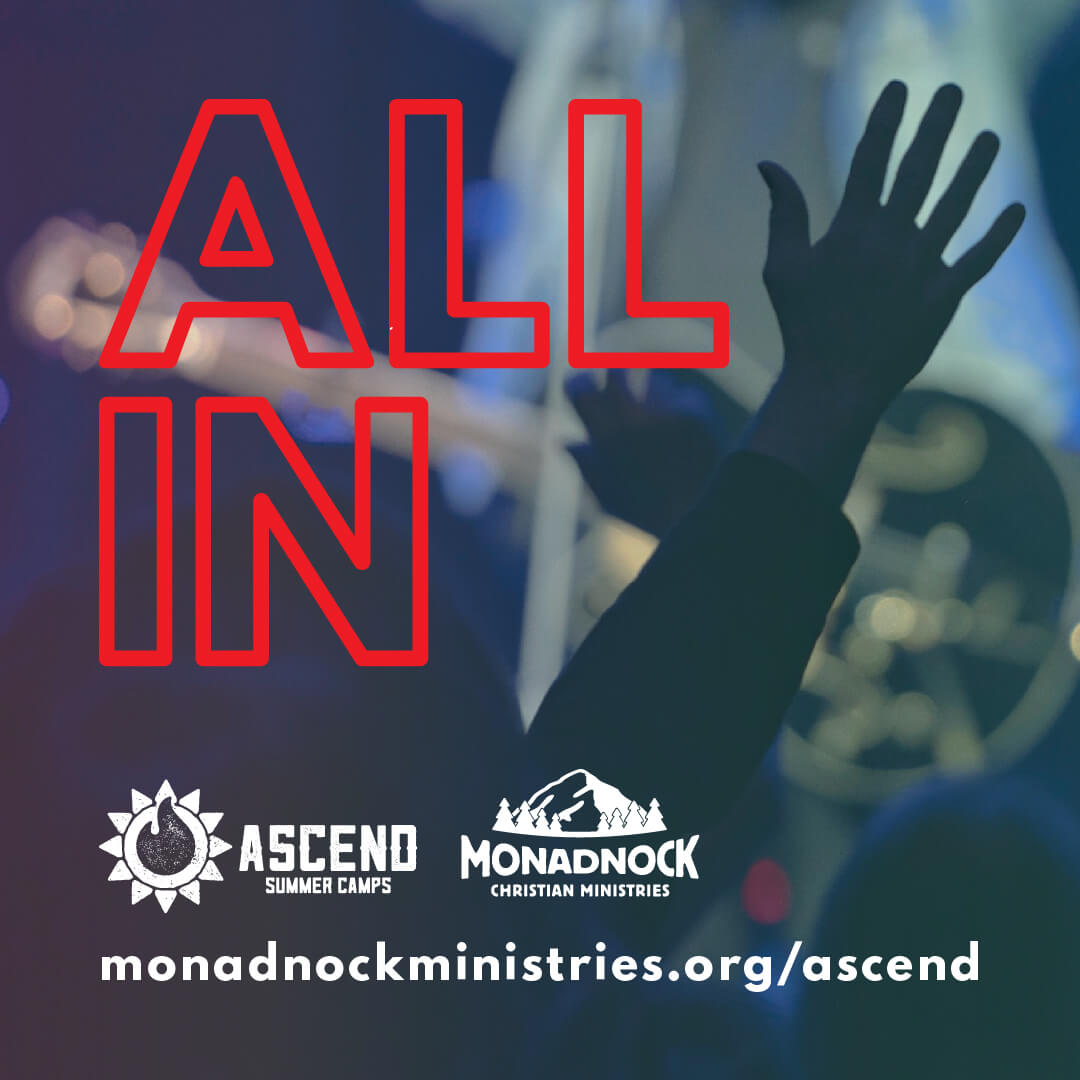
Camp Monadnock “ALL IN” Campaign
I worked with the camp on a few different social media campaigns for family weekend events they were planning. Each set of images had a different theme, but certain items were consistent across designs such as the camp logos and text styles. Colors were consistent within each campaign. Certain visual elements were adjusted when the designs were switched from horizontal cover images to square post images.
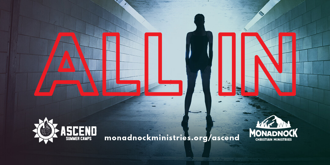
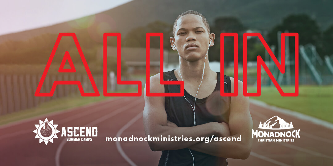
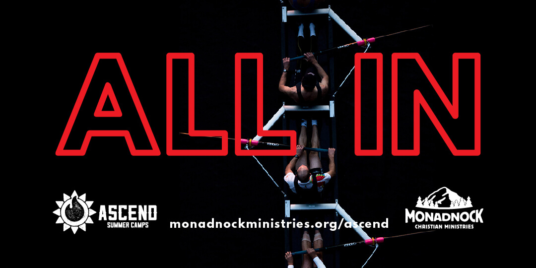
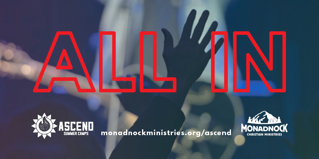
The Ascend Summer Camps “ALL IN” campaign cover image designs below are edgy and modern and have a visual focus between the words “ALL IN” to reinforce the message to teenaged campers of living their faith all the time with everything they have.
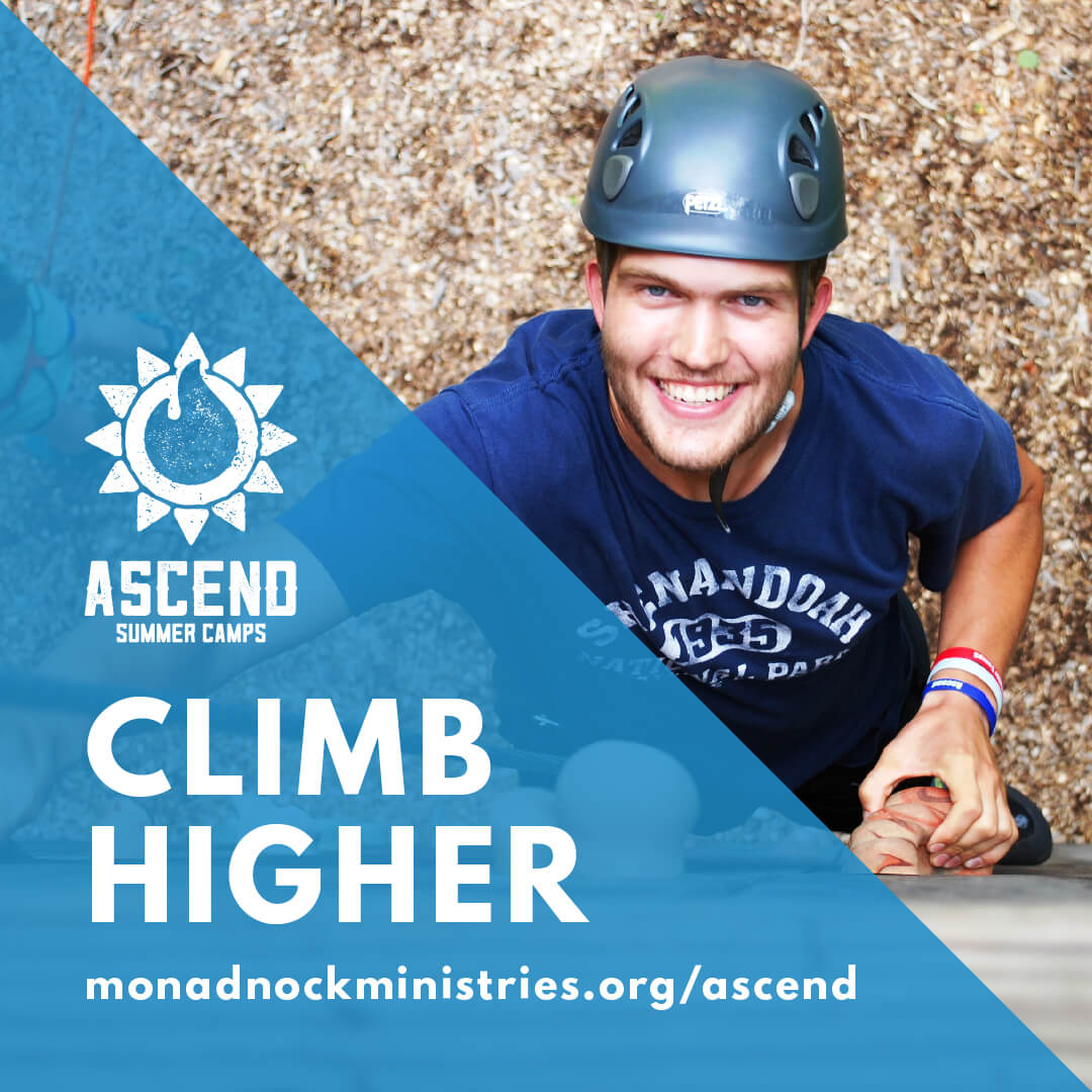
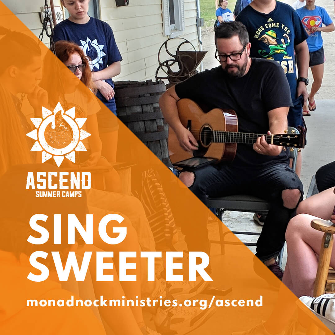
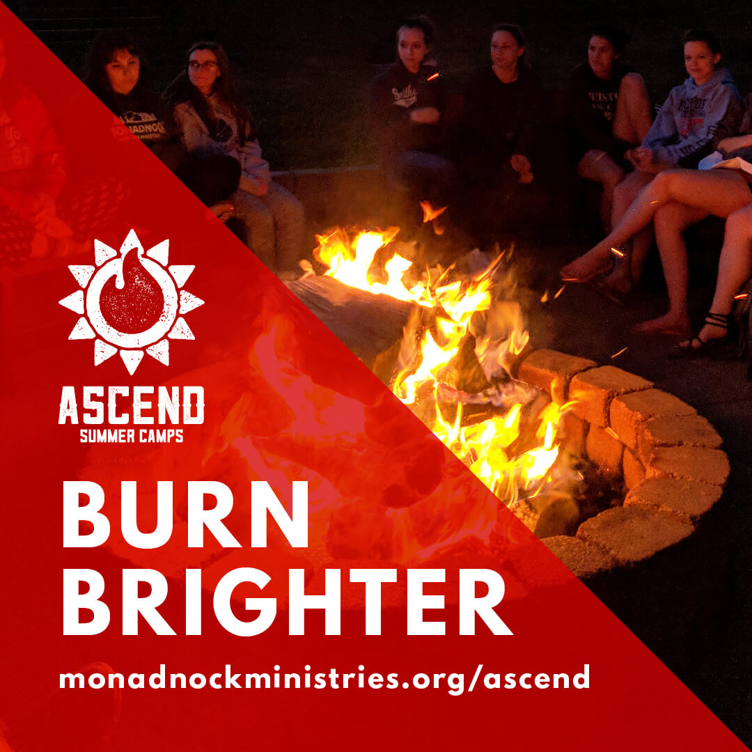
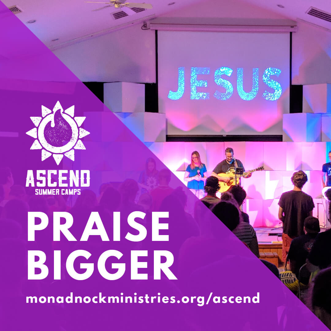
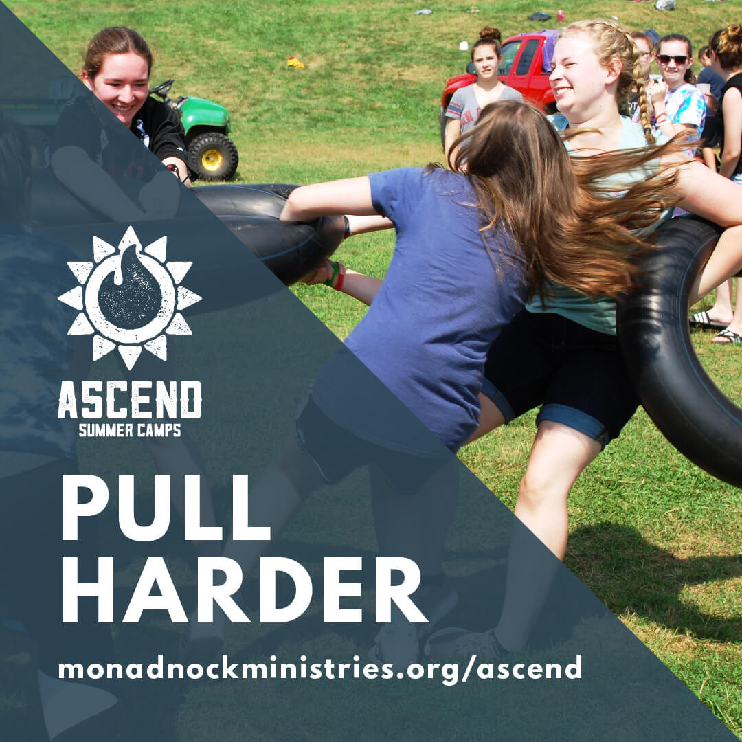
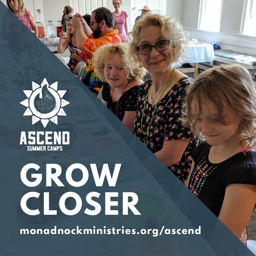
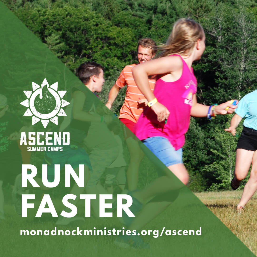
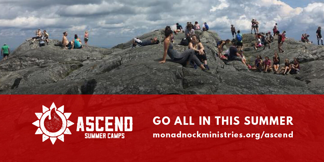
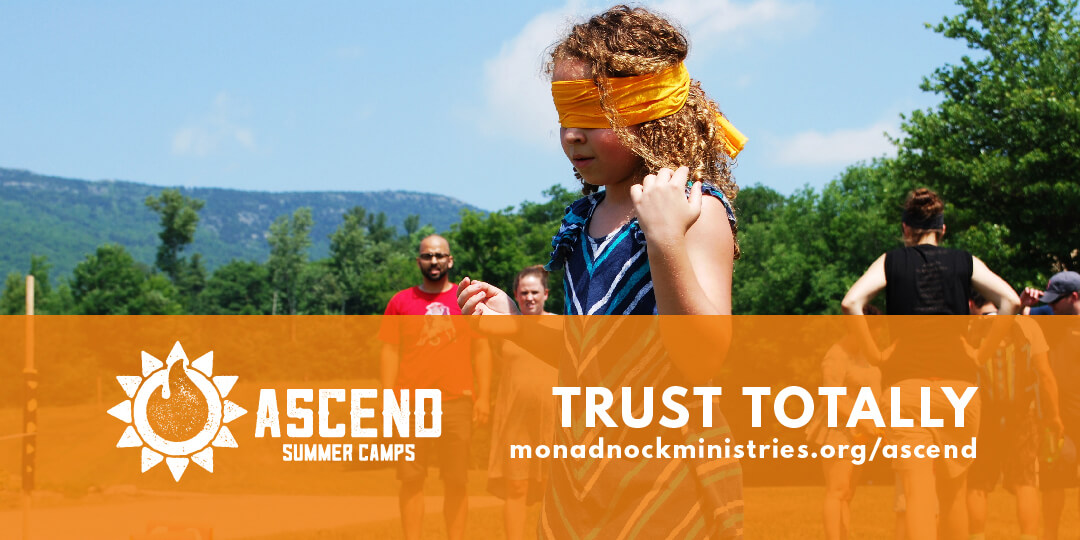
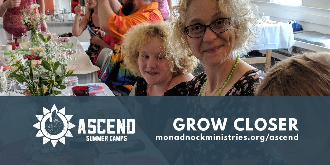
Camp Monadnock Ascend Summer Family Campaign
The theme for this campaign was families spending time together at camp, so the imagery was focused on that. The overall designs were also friendlier and used photos of actual campers, staff, and activities.
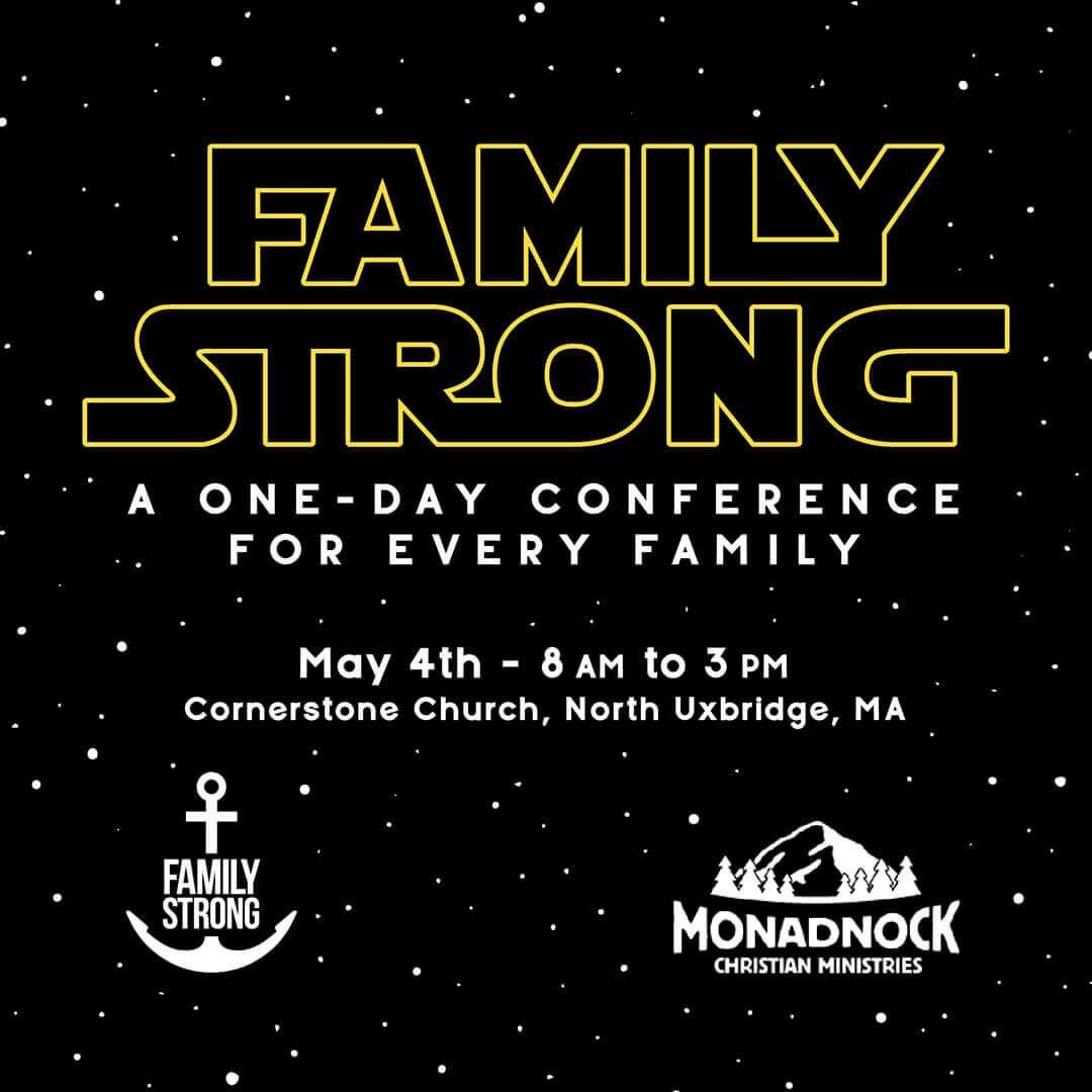
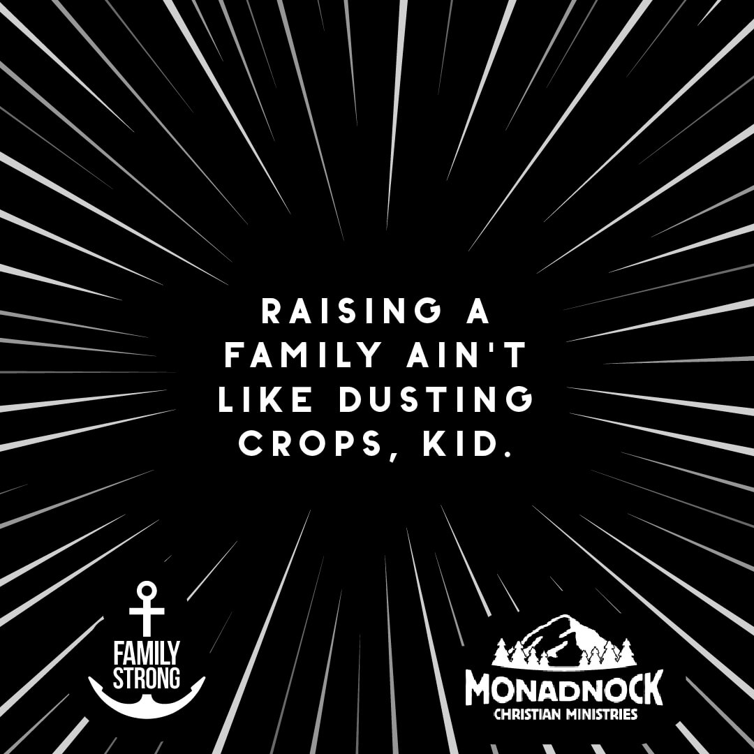
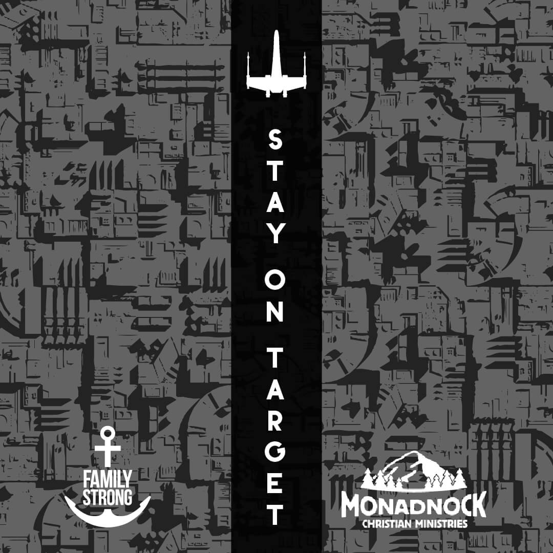
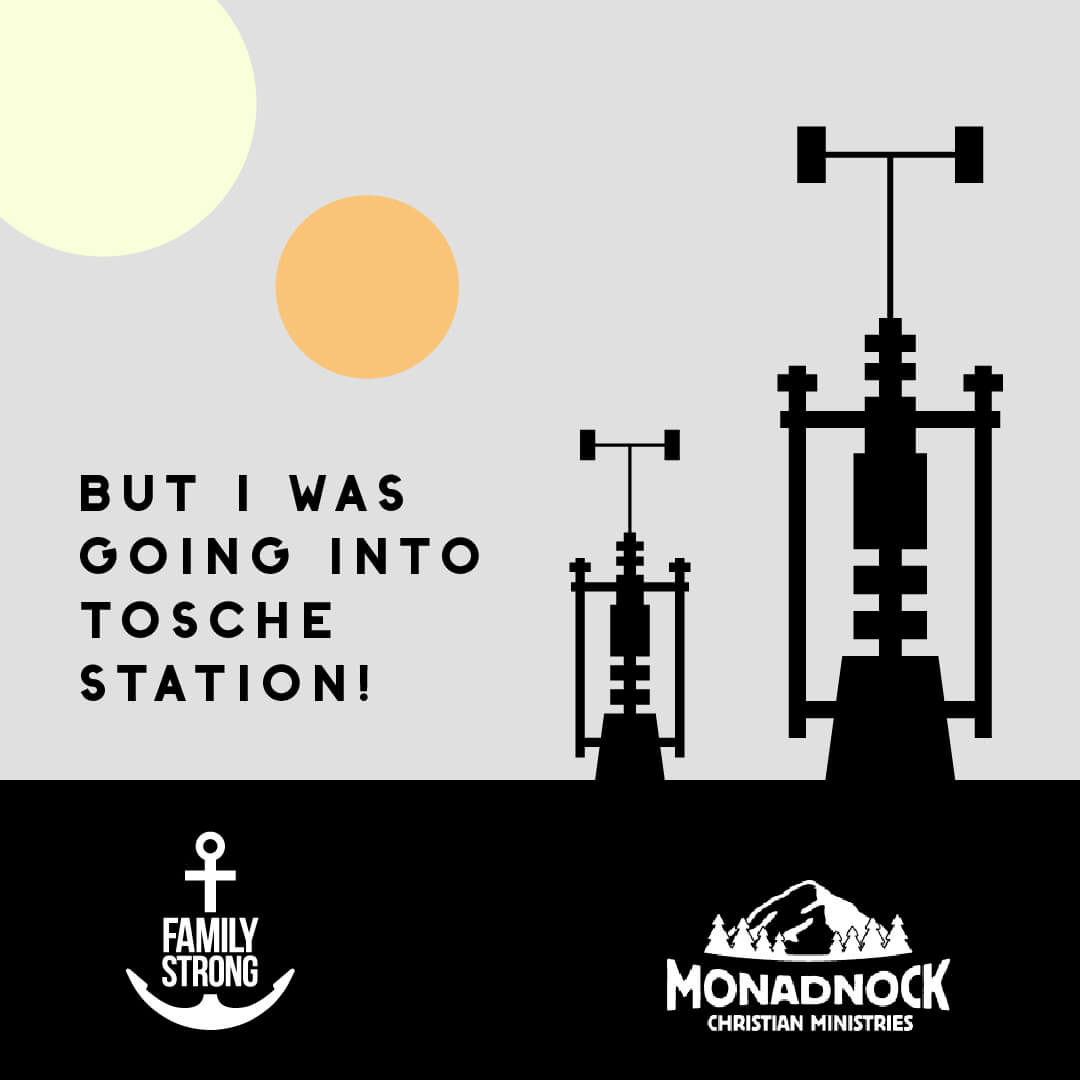
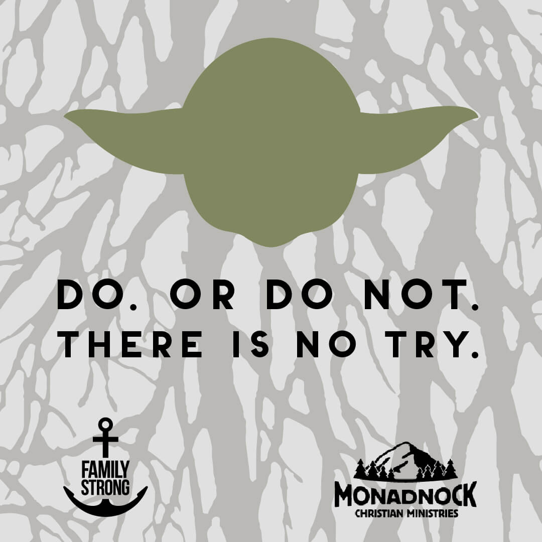
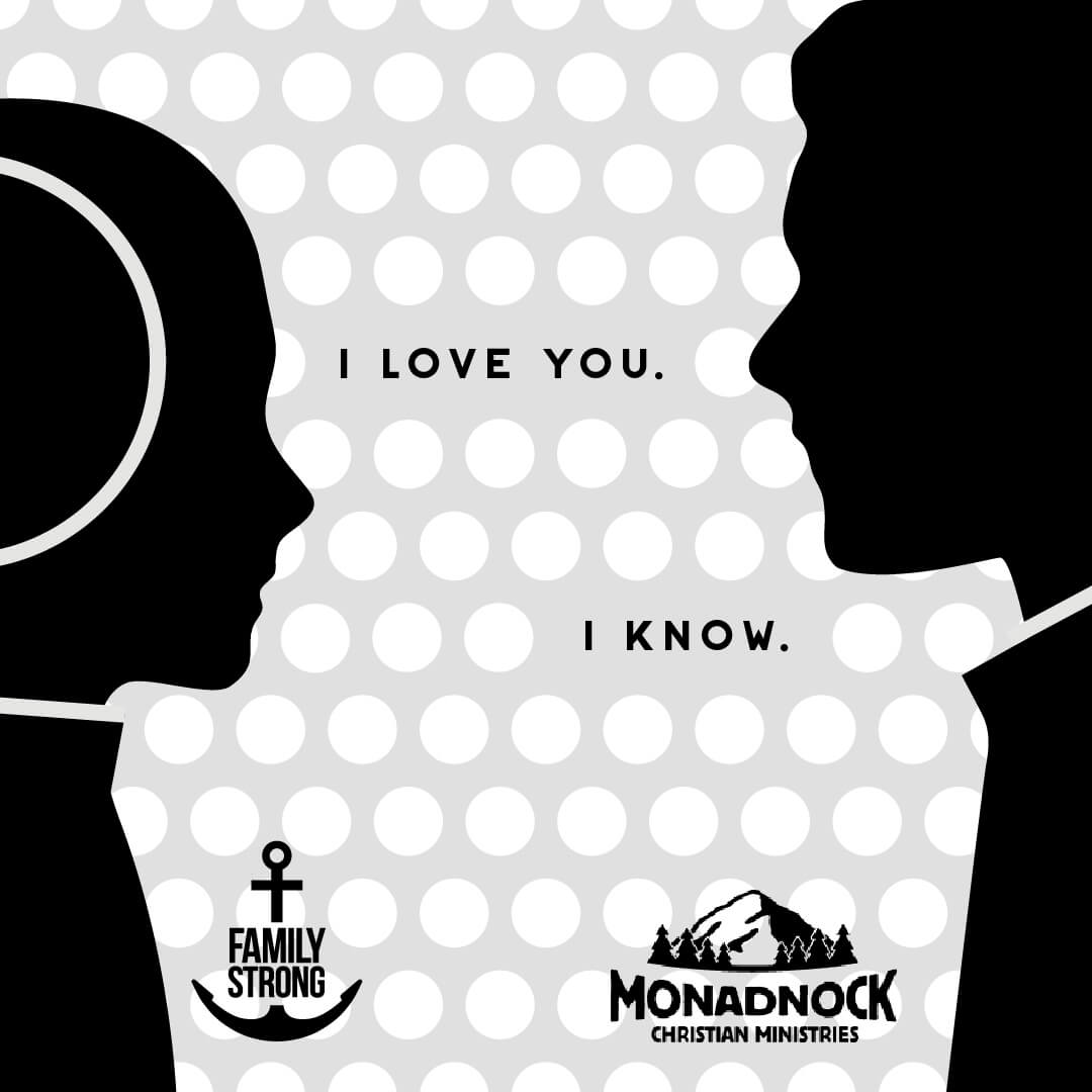
Camp Monadnock Family Strong Campaign
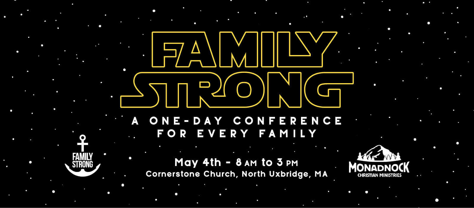
Since Camp Monadnock serves mostly youth and families, they have a lot of fun-themed events. The “Family Strong” conference was based on Star Wars, so when I was asked if I could create illustrations that not only advertised the event but could be used for the individual sessions, I jumped at the chance. The other really cool thing about this campaign is that the conference itself happened on May 4, Star Wars Day!
