The Challenge
A local film festival needed a new site that featured event details, a prominent social media feed and incorporated elements of its branding in a creative way.
The Solution
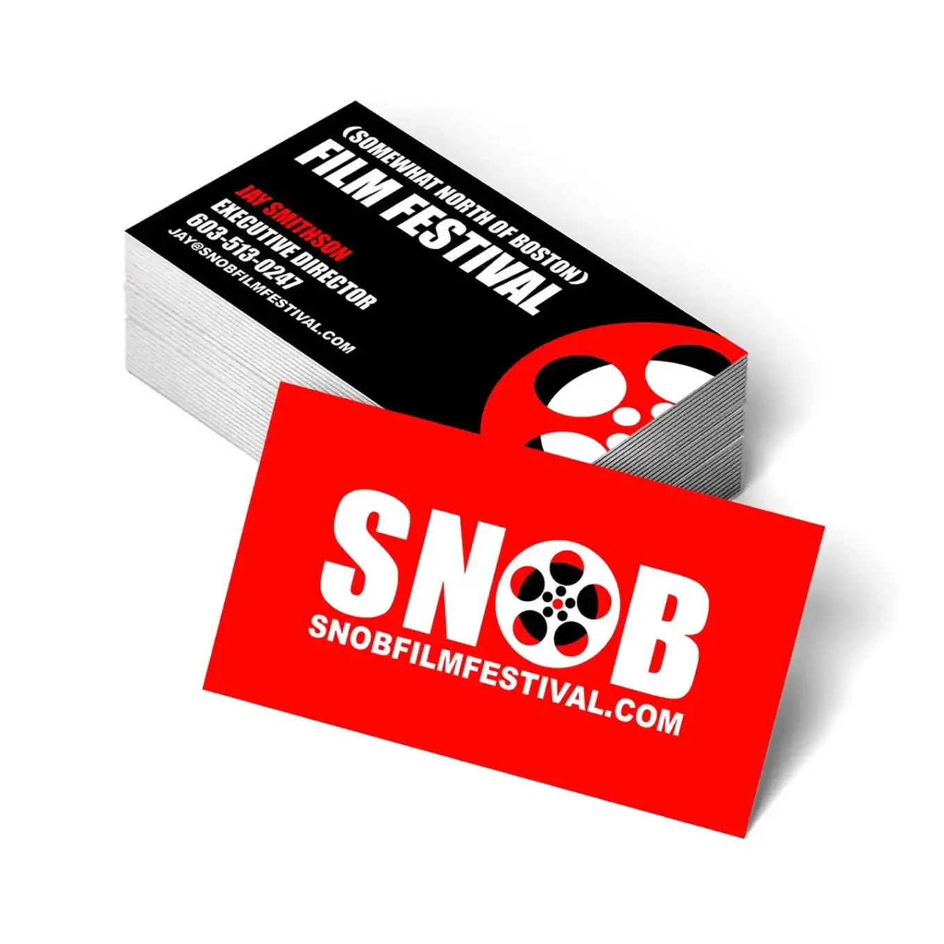
The site is a good example of Flat-Skeuomorphism. It’s evocative of a newspaper with a simple movie poster/film festival program cover laid on top on the homepage. It uses large areas of solid colors without relying on material textures to make its point. Posters, business cards and festival program designs were also created. BONUS: Working with a local film festival was a great way to be creative AND see some great independent films!


The film posters were printed large so they’d be really easy to see. The bold logo at the top grabbed attention right away.

The red, black and white design was carried over to the business cards and brochure as well.


