This Post Has Been Flagged
I recently entered a competition to redesign the city flag of Laconia, NH – spoiler alert: I won.
Not So Fast
After receiving over 100 entries and narrowing those to 6 semi-finalists, the City Council voted to keep their existing flag. They still chose a winner for the contest, but knowing the redesigned flag won’t be flying over Laconia makes the victory a little less satisfying.
In the end, it was still a great exercise and the challenge of designing a flag was a lot of fun.
My Design


Why I Entered
As a rule, I don’t enter design competitions. Bruce Mau said it well in his Incomplete Manifesto:
Don’t enter awards competitions. Just don’t. It’s not good for you.
,
For the most part I agree with this. The amount of time and energy spent creating something with such a small chance of reward can be frustrating. But every so often, an opportunity to design something great comes along and makes the award part not matter – or matter less. Winning is great, but for me, creating is its own reward.
So why did I enter? Here are my reasons, in no particular order:
- About a year ago, I watched a TED Talk about flag design by Roman Mars. Check it out here.
- By the end of his 18 minute talk:
- I was blown away with how poorly the majority of city flags were designed – like, super cringy (or is that cringey?).
- I was impressed with how well a flag could be designed when a few simple design principles were applied.
- I wanted to design a freakin flag!
- 6 months later, my wife sent me a link to City Flag of Laconia Facebook page, telling me they had a competition to redesign the city flag.
- I really wanted to design a freakin flag!
The design had to follow the “5 Basic Principles of Flag Design” as presented in the “Good Flag, Bad Flag, How to Design a Great Flag” design guide compiled by Ted Kaye. You can download a PDF for reference here.
5 Basic Principles of Flag Design
- Keep it simple. A flag should be so simple that a child can draw it from memory.
- Use meaningful symbolism. The flag’s images, its colors and its patterns should relate to what it symbolizes.
- Use just two to three basic colors.
- Don’t use words or seals, because they can’t be easily read from a distance or on the backside of a flag.
- Be distinctive. A good flag captures the place, its people and its history.
Kaye said, “It also creates a central rallying point for civic pride,” Kaye says. “It helps link people in the community saying, this is us, here we are under our flag.”
Thinking Behind the Design
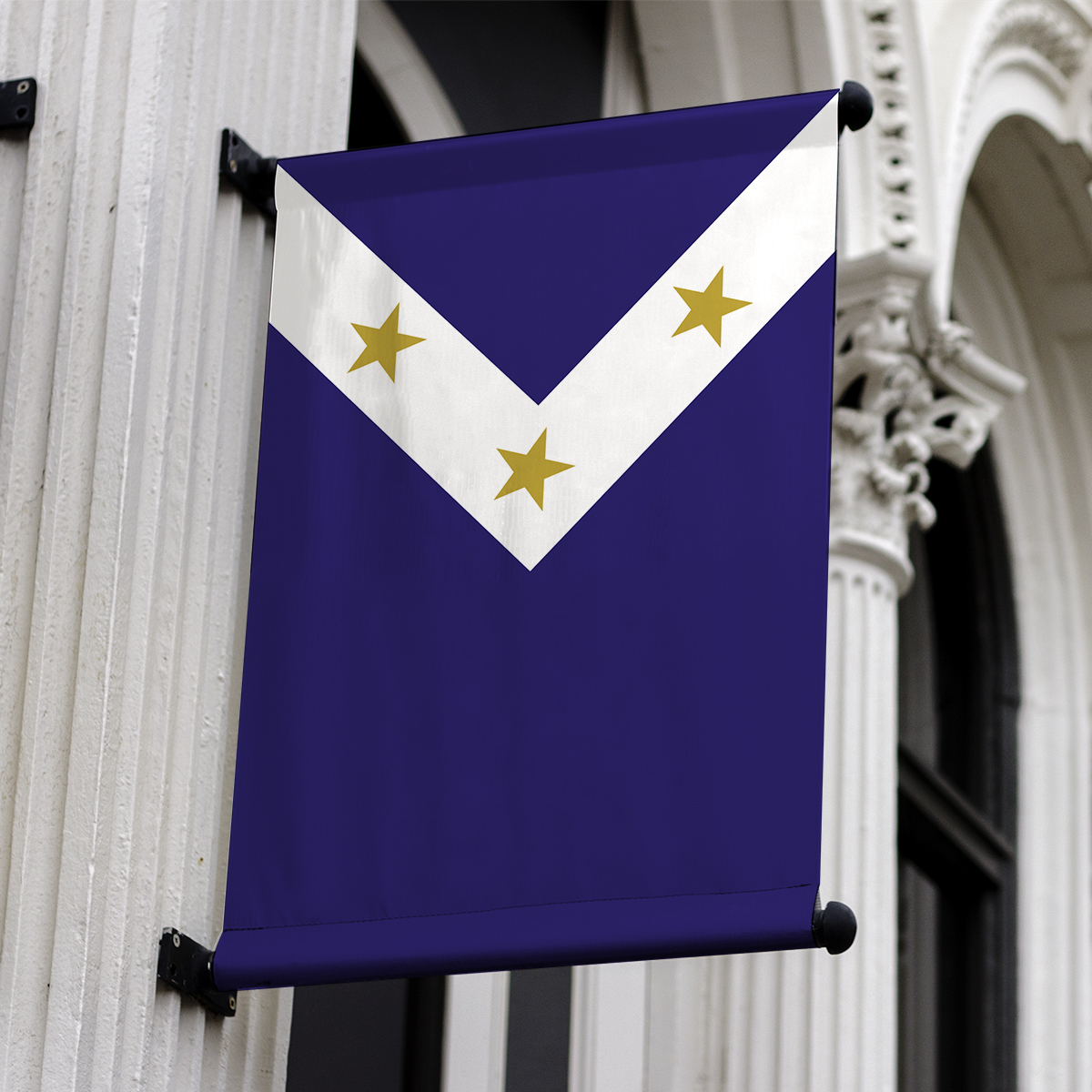
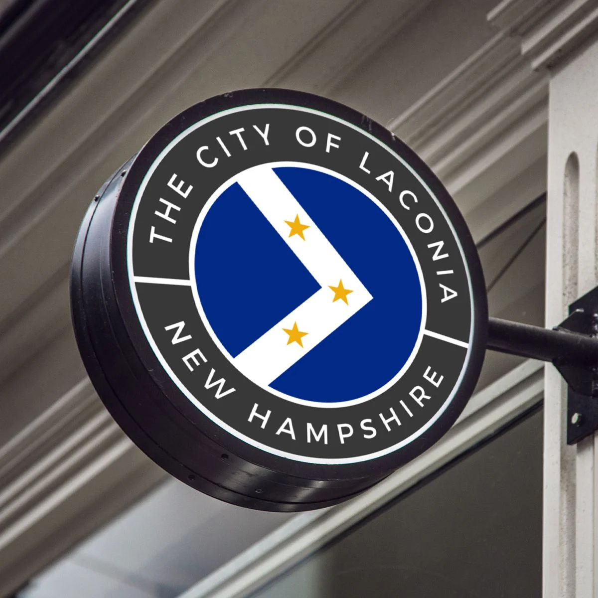
The flag design consists of three gold stars on a band of white over a blue background.
- The 3 gold stars represent 3 ideas relating to Laconia:
- Place. City, State and Nation: Laconia citizens are not only a part of the city, but also of the state of New Hampshire and the United States.
- Legacy. Industry, Transportation and Tourism. Laconia has a rich historical legacy of manufacturing (lumber, shoes, textiles etc.). Horse drawn carriages and later freight cars and streetcars were built at the Laconia Car Company. With its prominent place in the Lakes Region, tourism has become a major drawing point to Laconia, including popular events at and around Weirs Beach, Motorcycle Week, and the NH Pumpkin Festival.
- Time. Past, Present and Future. Laconia is a city that remembers and continues to learn from the past, while experiencing the joy of the present, and continuing to change and grow into the future.
- The white band separates the blue background into two areas, representing how Laconia separates the Winnisquam and Winnipesaukee lakes.
- When the flag is horizontal, the white field points to the right, representing moving forward and growing in a positive direction. When the flag is vertical, the white band shows a path of stars moving down and then up, reminding us that although life can bring us down, when we learn to overcome it, we can move forward and up again.
Extended Uses
The design has the potential to become more than just a flag. It can become part of a new, larger visual brand and identification system for Laconia including signs, stickers, patches, t-shirts, town seals etc.
Thank You
I want to thank the Laconia City Council, the competition organizer Ms. Bree Henderson, and everyone else involved with the competition – especially the other designers. I know how much time and effort go into something like this, and the fact that so many people got excited about a new way to represent the City of Laconia is great.
