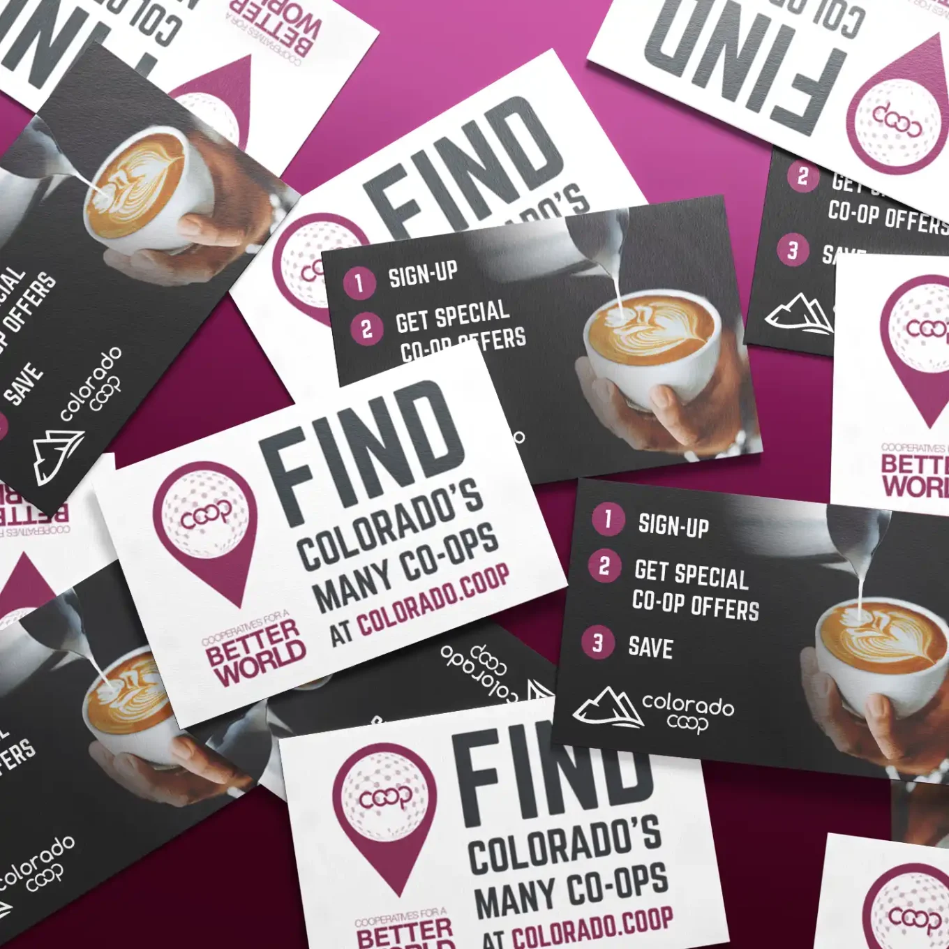
Marketing Designs and Collateral
The designs below are from a marketing campaign that took place over the course of a month or so, leading up to an annual conference. The series of display and retargeting ads below were used to generate awareness and drive engagement.
During this project, I collaborated with a marketing copywriter* who created the messaging. Designs were based on existing brand guidelines that I was able to expand upon and improve,
This isn’t all of the collateral I helped create, but it’s a good representation of the types of pieces I worked on.
The Result
Not only did the campaign successfully build greater brand awareness and online engagement for the co-op itself, but it also increased event attendance from the previous year by almost 300%!
Email Infographic
The first design task and challenge was to breathe new life into an email infographic that had been previously created. Although there was existing branding, the previous design definitely didn’t follow those guidelines.
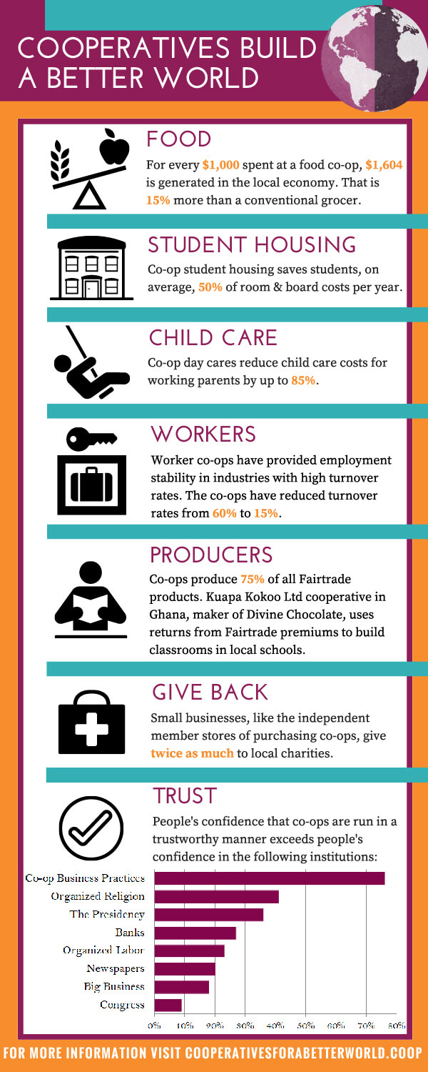
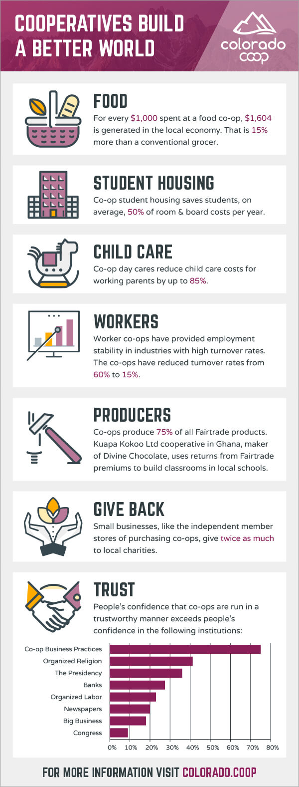
Because the content wasn’t changing, I was able to refresh the design by using the brand font, adding new (cleaner and more interesting) icons, increasing the white space and making the section separations softer (the orange and teal separator lines in the previous design were a bit too bold). This new infographic influenced the look and feel of the other design work in the rest of the campaign.
Social Media Ads
A series of targeted ads were designed to increase brand awareness and audience engagement in a variety of areas including retail, food, and active lifestyle categories.

Carousel ads were used to share messages in interesting and engaging ways.


11×17 Tri-fold Brochure
Next, we created on a brochure that was mailed to potential coop members, as well as handed out at events.
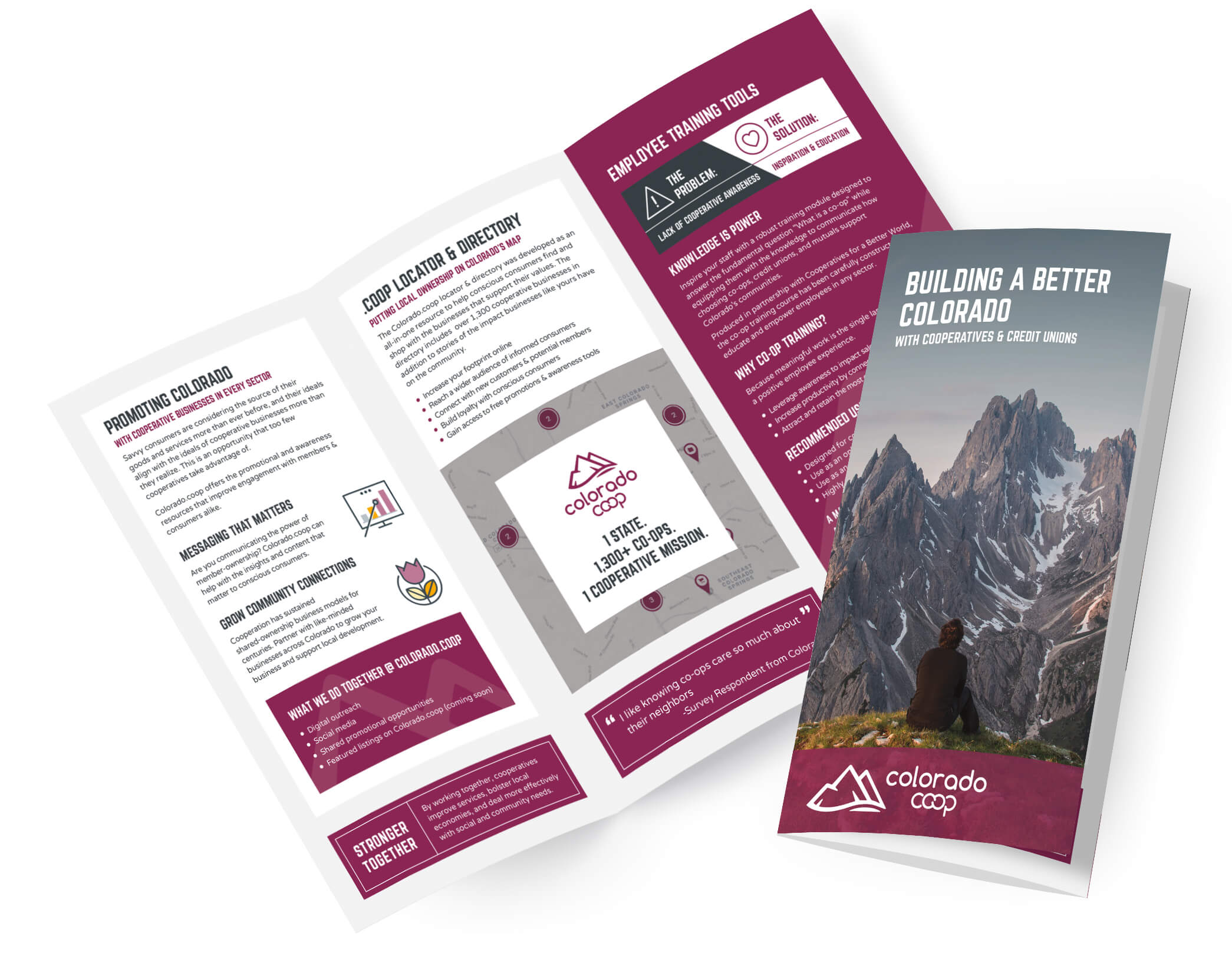
I worked with the copywriter over the course of a week or 2 to figure out the content and layout. There were multiple rounds of revisions since many members of the company had to weigh in on the messaging and imagery.
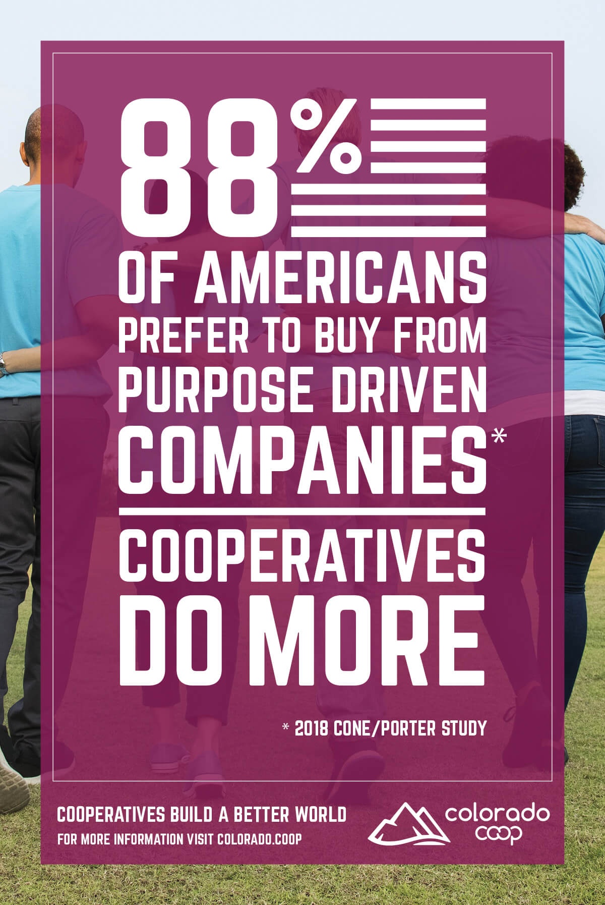
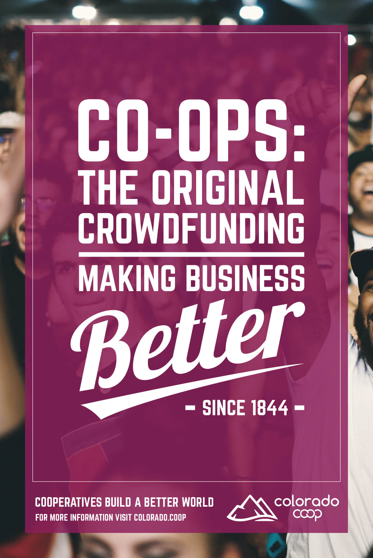
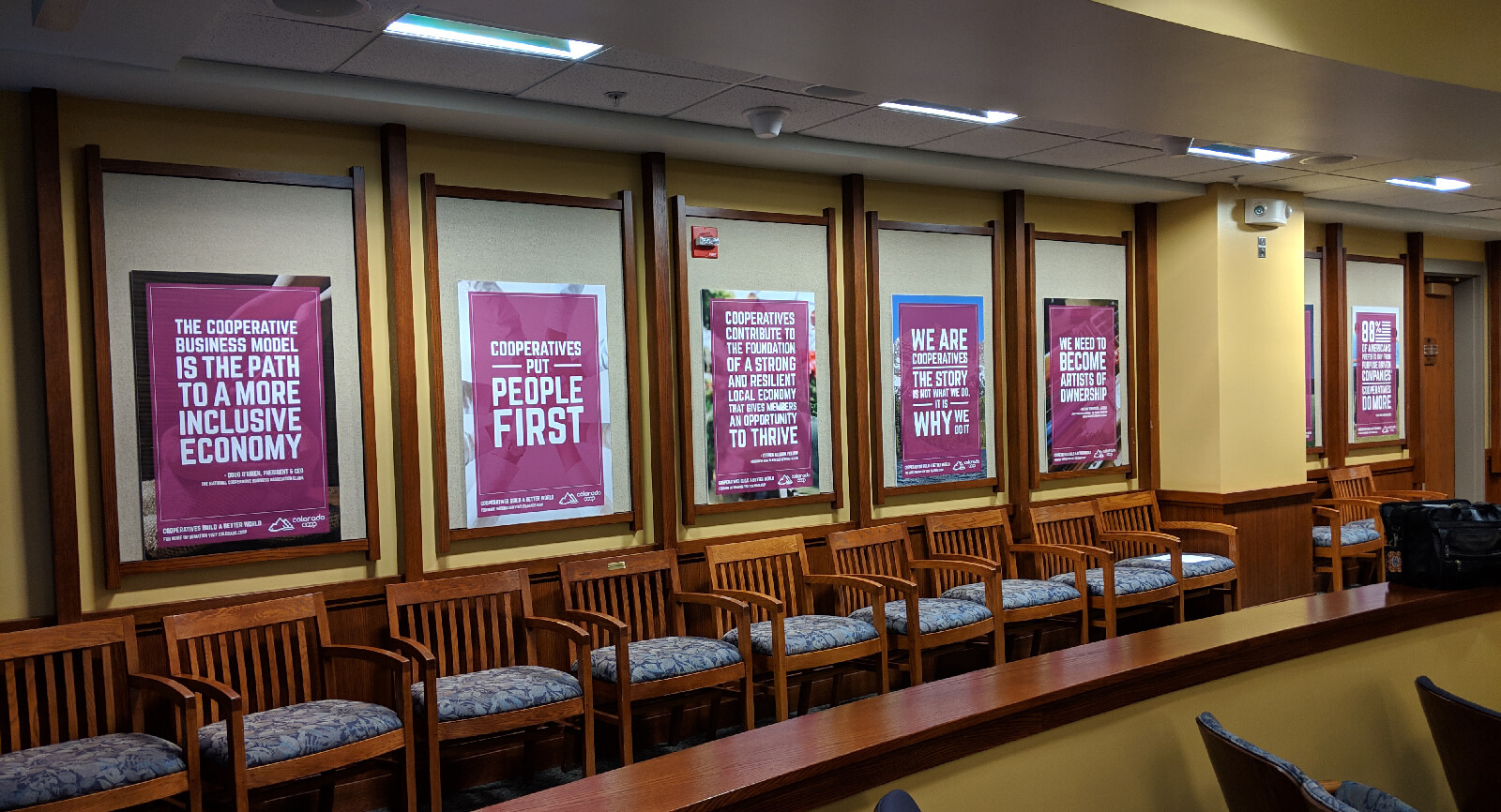
Event Posters
These posters were displayed at an event at the end of the campaign. The bold, designed text treatments allowed each poster to have its own look while maintaining an overall similarity to the rest of the posters and campaign materials. A sample of the many posters I created is shown below.
Stand-Up Banner
The company I worked with attends many conventions within their industry as well as events they plan themselves. The goal for the banner design was to include information and visuals that explained what the campaign was in a clear, concise way.
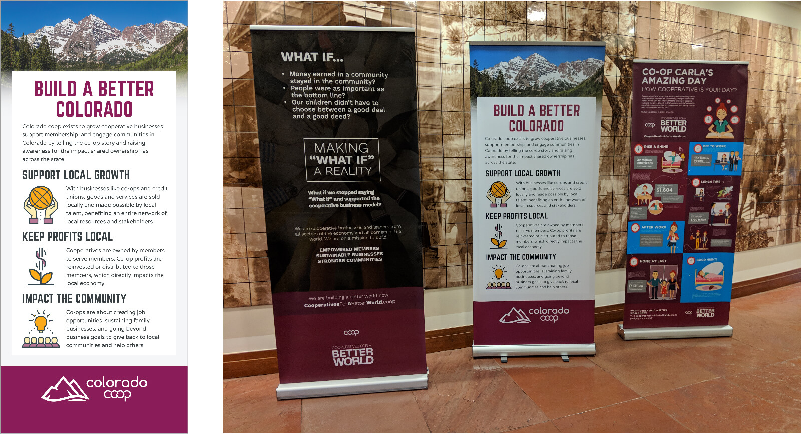
The biggest challenge was that the new design had to be completely unique while also relating to the existing banners. The colors and icons (from the set we used in the earlier infographic design) also help it relate to the rest of the marketing campaign.
Newspaper Ad
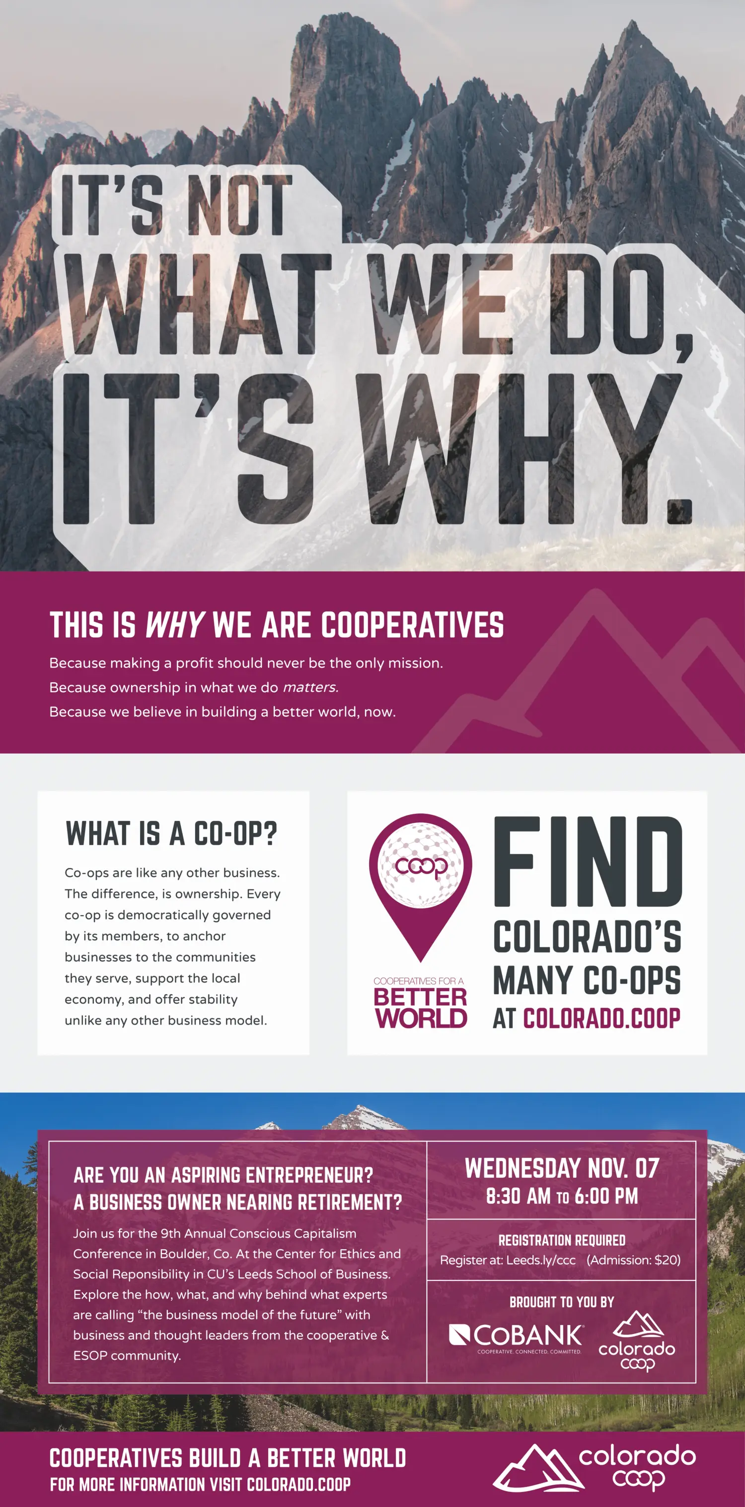
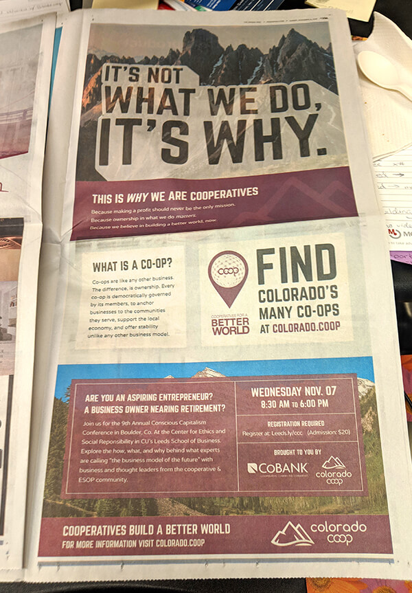
This full-page ad was featured in USA TODAY in the Denver metro area. It’s eye-catching, but the colors certainly changed when it was actually printed. Because of a tight deadline, I had to design the ad without knowing the type of paper or printing the newspaper was using. In the end, it all worked out fine.
* It’s always exciting to work with my copywriting collaborator Mark Hoban. He crafted the content for this campaign and helped make coming up with creative ideas to visualize the messaging a lot of fun! Check him and some of his work out here.
